
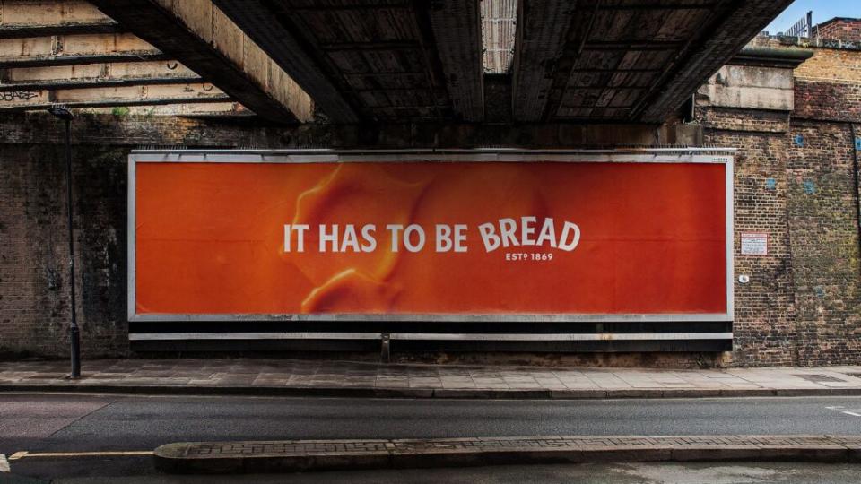
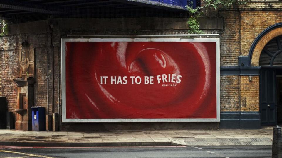
In a world obsessed with visibility, Heinz just proved it does not need to shout to be seen. Its latest campaign titled “It Has to Be” skips the logo entirely and still lands the message. Created by Wieden and Kennedy London, the campaign features close-up shots of Heinz staples like baked beans on toast and tomato soup with fries, paired with simple phrases such as It has to be toast or It has to be fries.
There is no logo and no brand name. Just the unmistakable product and the classic Heinz label shape and typeface. And that is exactly why it works.
Minimalism That Shows Brand Confidence
This is not just a clean design choice. It is a statement. Heinz is trusting the power of memory and familiarity. When a brand can drop its name and still be instantly recognized, it speaks volumes about its cultural imprint.
Design Driven Identity
The campaign leans entirely on visual cues Heinz has owned for decades. The curved label, the font, and the way the product looks on the plate all act as stand-ins for the brand name. It is a lesson in how design can quietly carry powerful recognition.
Standing Out by Toning Down
In a world full of loud advertising and aggressive branding, Heinz took the quiet route and still got noticed. This is not a rejection of branding, it is branding at its most refined. Heinz knows it has earned the right to go subtle.
Key Takeaway
Heinz shows that true brand strength lies in recognition without explanation. When your product and visual language are iconic, you do not need to say much at all.