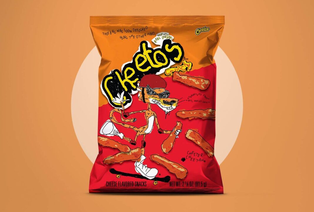
If you have ever enjoyed Cheetos, you know the experience well, those bright orange, cheesy fingers that are hard to clean quickly. Instead of hiding this messy trademark, Cheetos embraced it fully with their clever new campaign called “Other Hand.”
The brand created a unique custom font named Cheetle Type, made entirely from real fingerprints stained with that iconic orange dust, also known as Cheetle. This playful font appears across advertisements, packaging, and digital content, turning a messy snack moment into a bold and creative statement. The campaign’s simple message is genius: when one hand is busy snacking, the other hand can still get creative even if it is a little messy.
This stunt perfectly captures what makes Cheetos special: fun, irreverent, and unapologetically messy. By owning their quirks, Cheetos transforms something ordinary into a memorable brand experience that stands out in a crowded market.
Key Takeaway
Cheetos proves that sometimes your biggest brand quirks, even the messy ones, can be your greatest creative assets. Authenticity and fun are more important than perfection every time.
